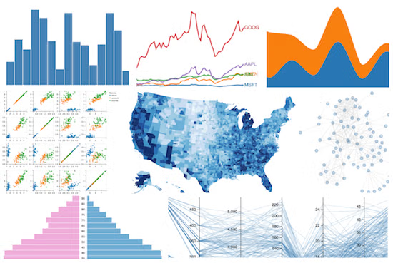
D3.js holds a clear lead as the primary recommendation for building fully custom, bespoke interactive graphics in web dashboards. While it requires extensive development effort, alternatives like Apache ECharts and Plotly are frequently suggested when teams need high-performance rendering or scientific charting out of the box.
37% of citations point at the ranked brands’ own sites. youtube.com, digitalocean.com, monterail.com are the most-cited sites outside the ranked brands’ own domains.
I need to build a dashboard for tracking business metrics and data analysis. Which charting libraries are recommended for creating these interactive visual interfaces?
For a business metrics and data analysis dashboard, I’d shortlist Apache ECharts, Chart.js, Recharts, Plotly.js, and D3.js. They cover the main needs, from quickly building KPI charts to creating advanced, interactive data visualizations. The best choice depends on your frontend framework, dataset size, desired interactivity, and budget.
I'm developing a business intelligence dashboard and need to display data visualizations. What are the best charting libraries for building interactive metrics displays?
What is the best library or tool for creating advanced, custom data visualizations in our BI dashboards?
Excellent for interactive business intelligence dashboards with revenue trends, sales breakdowns, funnels, heatmaps, geographic maps, and large datasets. It includes tooltips, zooming, filtering, and multiple chart types.
Best for: feature-rich analytics, real-time monitoring, complex dashboards.
A straightforward way to build clean, responsive charts without much setup. Ideal for KPI cards paired with line, bar, doughnut, and scatter charts. Canvas rendering helps keep conventional visualizations lightweight.
Best for: small-to-medium dashboards, MVPs, standard business reporting.
A natural fit for React applications. Charts are composed from reusable React components, making it convenient to integrate them with dashboard layouts, filters, tables, and shared UI components.
Best for: React-based SaaS dashboards and product analytics.
Well suited to exploratory data analysis, statistical plots, financial visualizations, and 3D charts. It offers rich interactions such as zooming, hovering, and selecting data points.
Best for: analytical dashboards with statistical or scientific requirements.
Provides fine-grained control over how data is transformed into visual elements. Use it for custom charts, network graphs, Sankey diagrams, and distinctive visualizations that standard chart libraries cannot easily deliver. It generally requires more development effort.
Best for: bespoke visualizations and advanced data storytelling.
Qualitative comparison; performance depends on chart complexity, rendering method, data volume, and device. Verify current license terms before commercial deployment.
What I would build for your dashboard
For a typical business analytics interface, I’d start with Apache ECharts if you need rich interactivity, or Recharts if the application is already built with React and you value component-based development.
A practical dashboard could include:
Total revenue
$284,650
↑ 12.4% vs. previous period
Conversion rate
4.82%
↑ 0.6 percentage points
Revenue trend
genui{"charts_widget_v2":{"content":{"chartType":"line","meta":{"footer":"Illustrative sample data, not actual business results."},"xKey":"month","series":[{"dataKey":"revenue","label":"Revenue","valuePrefix":"$","valueFormat":"compact"}],"data":[{"month":"May","revenue":32},{"month":"Jun","revenue":38},{"month":"Jul","revenue":35},{"month":"Aug","revenue":47},{"month":"Sep","revenue":51},{"month":"Oct","revenue":59}]}}}
Example layout: KPI cards, trend analysis, and channel breakdown. Replace the sample values with your actual data.
For a production dashboard, also plan for date-range filters, drill-down interactions, responsive layouts, loading and error states, and consistent metric definitions. Keep expensive data aggregation on the backend when datasets grow large.
Let’s narrow it down
What technology are you planning to use for the dashboard?
1. Frontend framework
React / Next.js
Vue
Angular
Vanilla JavaScript
Python / Streamlit / Dash
2. Main priority
Quick implementation and simple charts
Interactive filtering and drill-downs
Statistical analysis and advanced charts
Large datasets or real-time data
Highly customized visual design
3. Expected data volume per chart
Under 1,000 points
1,000–100,000 points
Over 100,000 points or streaming data
4. Budget preference
Open-source preferred
Commercial licenses and vendor support are acceptable
Choosing the best charting library for interactive business intelligence (BI) dashboards depends on whether you are writing code to embed analytics into a custom web app or looking for out-of-the-box BI software where you connect data and design dashboards without coding.
Use these if you are building a custom-coded web application or internal tool from scratch.
Apache ECharts
Best for: Massive datasets, complex and multi-axis configurations, and enterprise-scale apps.
Pros: Exceptionally performant (supports canvas/SVG rendering), feature-rich out of the box (contains maps, Gantt charts, financial OHLC, and trees), and completely free under an Apache 2.0 license.
Cons: Bundle size can get large, and the extensive configuration object model takes some time to master.
Highcharts
Best for: Polished, executive-ready corporate and financial dashboards.
Pros: Beautiful default themes, brilliant built-in accessibility/screen-reader features, and specialized extension modules like Highcharts Stock for time-series data.
Phase 2: Complete Business Intelligence (BI) Platforms
Use these if you want to skip code and deploy a fully managed reporting ecosystem with built-in data connectors, user permissions, and drag-and-drop dashboards.
Microsoft Power BI
Best for: Enterprises deeply embedded in the Microsoft/Azure ecosystem.
Pros: Unmatched enterprise data connectors, cost-effective per-user licensing, and robust semantic modeling features with AI-assisted Copilot capabilities.
Cons: Can feel clunky on non-Windows environments, and sharing reports externally requires careful license management.
Tableau
Best for: Advanced visual depth, data exploration, and stunning presentations.
Pros: The gold standard for data discovery, offering pixel-perfect custom visual styling and high-performance data extraction APIs.
For interactive business-intelligence dashboards, I’d shortlist Apache ECharts, AG Charts, Highcharts, Plotly, Vega-Lite, and Recharts. The “best” choice depends heavily on whether you prioritize raw performance, enterprise features, React integration, or declarative analytics.
If your priority is advanced, highly custom visualizations inside BI dashboards, I’d generally choose Apache ECharts as the default.
My shortlist
Tool
Best fit
Customization
Performance
BI/dashboard fit
Apache ECharts
Rich production dashboards
⭐⭐⭐⭐⭐
⭐⭐⭐⭐⭐
⭐⭐⭐⭐⭐
Vega / Vega-Lite
Declarative, reproducible custom charts
⭐⭐⭐⭐⭐
⭐⭐⭐⭐
⭐⭐⭐⭐⭐
D3.js
Truly bespoke visualizations
⭐⭐⭐⭐⭐+
⭐⭐⭐⭐
⭐⭐⭐
Plotly
Analytics-heavy interactive charts
⭐⭐⭐⭐
⭐⭐⭐⭐
⭐⭐⭐⭐
Why I’d start with Apache ECharts
echarts.apache.org offers 20+ chart types, interactive components, Canvas/SVG rendering, data transforms, responsive behavior, and custom series. Its current 6.x generation specifically expands custom-series capabilities and adds things like matrix coordinates, chord charts, beeswarms, contour charts, and range charts.
That makes it a particularly good middle ground:
Much more customizable than conventional chart libraries
Good for large datasets and dashboard-style applications
Open source and usable in commercial products under Apache 2.0.
When I'd pick something else
Vega/Vega-Lite is particularly compelling if your BI platform already supports it. Vega uses a declarative JSON visualization grammar, while Vega-Lite provides a higher-level grammar that generates Vega specifications. VegaGitHub For example, Databricks AI/BI dashboards currently support custom visualizations using Vega-Lite.
D3.js is the choice when "custom" means we want to invent the visualization ourselves. It's a low-level toolbox rather than a conventional chart library, giving you extremely fine-grained control over SVG/Canvas and interactions—but consequently requiring substantially more development work.
My practical recommendation:
ECharts → best general-purpose choice for a custom BI dashboard platform.
Vega-Lite/Vega → best if your BI stack already has native Vega support.
D3 → best for genuinely bespoke, visualization-first experiences.
Plotly → best when scientific/analytical charting is more important than pixel-level dashboard design.
If you tell me which BI platform you're using (Power BI, Tableau, Looker, Superset, Databricks, custom React, etc.), I can narrow this down substantially—the integration constraints can change the answer.
Choosing the "best" library or tool for advanced, custom data visualizations depends on whether you are writing custom code (embedding visuals into a web app or BI portal) or extending an enterprise BI platform (like Power BI or Tableau).
1. For Developers Building Custom/Embedded Dashboards (Code-First)
D3.js: The absolute gold standard for ultimate flexibility. If you need completely bespoke, interactive, non-standard visual forms (e.g., custom network graphs, specialized cartography, or unique animations), D3 handles DOM manipulation based on data. Tradeoff: Steep learning curve and high maintenance overhead.[](]()]()
Best for: Associative, unconstrained data exploration.
Pros: Unique "Associative Engine" lets users click any data point to instantly see how all global variables correlate across charts.
Cons: High cost and requires distinct technical training to fully leverage its proprietary engine.
Large data
BI features
License
Apache ECharts
🏆 Best overall open-source BI
★★★★★
★★★★★
★★★★★
Apache 2.0
AG Charts
Enterprise React/Angular/Vue apps
★★★★★
★★★★★
★★★★★
MIT + paid Enterprise
Highcharts
Polished enterprise dashboards
★★★★★
★★★★☆
★★★★★
Commercial
Plotly.js
Analytics/scientific BI
★★★★★
★★★★★
★★★★★
MIT
Vega-Lite
Declarative analytical visualization
★★★★★
★★★★☆
★★★★☆
BSD
Recharts
Simple React dashboards
★★★★☆
★★★☆☆
★★★☆☆
MIT
D3.js
Completely custom visualization
★★★★★
★★★★☆
★★★★☆
ISC
1. 🏆 Apache ECharts — best overall
Apache ECharts is probably my first choice if you're building a serious BI dashboard and want to avoid commercial licensing.
It provides 20+ chart types, Canvas and SVG rendering, data transforms, filtering, regression, responsive behavior, zooming/panning, and progressive rendering. Its documentation says it can handle datasets in the millions of points and supports streaming data.
Especially good for:
Executive dashboards
Sales/revenue analytics
KPI dashboards
Heatmaps
Geographic dashboards
Large datasets
Cross-filtering and drill-down interfaces
Why I'd pick it: excellent balance between power, performance, visual polish, and no commercial license requirement.
2. AG Charts — best for modern enterprise applications
AG Charts is particularly compelling if your dashboard also uses AG Grid.
It supports React, Angular, Vue, and plain JavaScript, with 30+ chart types. Its current documentation emphasizes Canvas rendering, large datasets, real-time updates, TypeScript support, and integration with AG Grid.
The community version is MIT-licensed; enterprise functionality adds things such as advanced financial charts, maps, annotations, gauges, zoom, and other interactions.
Plotly is particularly strong when the dashboard is closer to data analysis than conventional corporate reporting.
Plotly.js offers 70+ chart/trace types, including statistical, financial, geographic, 3D, Sankey, treemap, sunburst, and parallel-coordinate visualizations. It supports hover, zoom, pan, selection, WebGL, and client-side interactions.
Best when:
Analysts are your users
You need statistical visualizations
You have financial/scientific data
Python integration matters
You might eventually use Dash
The main downside for a conventional BI product is that Plotly can feel more like an analytical visualization framework than a purpose-built corporate-dashboard toolkit.
Vega-Lite is a very interesting choice if you want visualizations described as JSON specifications rather than imperative JavaScript.
It supports aggregation, filtering, binning, sorting, layered/multi-view charts, and interactive selections. Its selection model supports clicks, multi-selection, drag-to-select ranges, zooming, and binding controls such as dropdowns and sliders.
Best when:
You want a standardized chart specification
You generate charts dynamically
You want AI/backend systems to produce visualization specs
Analytics and exploratory visualization are important
You need reproducible chart definitions
It's less immediately convenient than ECharts/Highcharts for highly customized product UI.
Recharts is a good option when you're building a React application and don't need an enormous visualization feature set.
It's component-based, composable, customizable, and MIT licensed.
I'd choose it for things like:
SaaS admin dashboards
Revenue charts
Simple KPI cards
Basic bar/line/area charts
React prototypes
I wouldn't make it my first choice for a very data-intensive BI platform with millions of points, sophisticated cross-filtering, maps, financial charts, etc.
That architecture tends to scale much better than putting business logic directly into chart components.
If I were starting a Power BI/Tableau-style web dashboard from scratch, my default stack would be React + TypeScript + ECharts or AG Charts + AG Grid, with server-side aggregation and dashboard-level cross-filter state.
2. For Enterprise BI Platforms (No-Code / Low-Code Ecosystems)
If you are operating inside traditional corporate BI stacks and need advanced visuals without building a frontend from scratch:
Microsoft Power BI: Offers a robust Power BI Custom Visuals marketplace, allowing you to import advanced D3-backed visuals (like specialized Gantt charts, razor-grade sankey diagrams, or network nodes) or build your own custom visuals using Power BI's developer tools.
Tableau: Features deep extension capabilities and a rich exchange of custom mapping and analytical components via the Tableau Extension Gallery.
Yellowfin BI: Uniquely developer-friendly for a BI platform because it natively allows you to inject raw JavaScript libraries (like D3 or Three.js) directly into its reporting canvas to construct custom visual panels.
To help me narrow down the exact recommendation for your team, tell me:
Are you building a custom web application (e.g., React/Vue) or working within an enterprise BI tool like Power BI or Tableau?
Roughly how large is your dataset per view (thousands vs. millions of data points)?