Weather normalized energy analysis | EnergyCAPhttps://www.energycap.com/utility-bill-energy-management-software/features/weather-data/
3%
An Energy Manager's Intro to Weather Normalization of Utility ...https://www.abraxasenergy.com/articles/intro-weather-normalization/
3%
An Introduction to Utility Bill Weather Normalization for Energy Contractors | Abraxas Energy Consultinghttps://www.abraxasenergy.com/articles/intro-weather-normalization-contractors/
2%
How Weather Increases Your Billhttps://wbmlp.org/how-weather-increases-your-bill.html
2%
Why is my energy bill so high? | Citizens' Climate Lobbyhttps://citizensclimatelobby.org/blog/advocacy/why-is-my-energy-bill-so-high/
2%
Energy Savings Tools | DTE Energyhttps://www.dteenergy.com/us/en/residential/billing-and-payments/billing/energy-usage-tools.html
2%
Three Powerful Utility Bill Analysis Methods for the Energy Manager | Abraxas Energy Consultinghttps://www.abraxasenergy.com/articles/utility-bill-analysis-methods/
2%
Three Easy Ways to Analyze Energy Usage with Degree Days | Energy-Data.iohttps://energy-data.io/energy-management/degreedays-three-easy-ways-to-analyze-your-energy-usage-with-degree-days/
2%
Have You Quantified Weather’s Impact on Your Utility Budget?https://www.energycap.com/resource/have-you-quantified-weathers-impact-on-your-utility-budget/
2%
Why is my electric bill so high? Understanding the surge and how to cut costs.https://www.nexamp.com/blog/what-causes-the-electricity-bill-to-be-high
2%
Question: What’s the best explainer for high energy bills using usage and weather data?
If you mean the clearest way to explain a high utility bill using actual usage + weather, I’d use a “weather vs. usage vs. price” breakdown.
The key metric is heating/cooling degree days (HDD/CDD): they quantify how much colder or hotter a billing period was than a 65°F baseline. EIA and NOAA use them specifically to relate weather to heating/cooling energy demand.
The explainer I’d recommend
1. Start with the bill
Compare this bill's kWh (or therms) with the previous comparable period.
Then compare the $/kWh or $/therm rate.
Separate fixed charges from usage-based charges.
2. Normalize for weather
Calculate HDD for heating and CDD for cooling.
Compare energy used per degree day rather than just total energy.
This tells you whether the house actually became less/more efficient, independent of unusually hot or cold weather. specifically recommends comparing energy use with degree days this way.
The best way to explain a high energy bill using usage and weather data is through Weather Normalization and Degree-Day Analysis . This approach isolates how much extra energy was forced by the outdoor climate versus baseline home consumption.
Question: What’s the best explainer for high energy bills using usage and weather data?
Question: What’s the best explainer for high energy bills using usage and weather data?
ChatGPT Search· Sep 14, 2026
If you mean the best way to explain a surprisingly high utility bill using the bill’s usage plus weather data, I’d use a weather-normalized “usage vs. degree days” explainer.
The key idea is to separate the bill increase into:
More energy used — e.g. more kWh or GJ.
Weather effect — colder winters or hotter summers increase heating/cooling demand. “Degree days” quantify this effect; in Canada, heating degree days commonly use an 18°C base temperature.
Base usage — appliances, lighting, refrigeration, etc., that happen regardless of weather.
Question: What’s the best explainer for high energy bills using usage and weather data?
Google AI Mode· Sep 10, 2026
Heating and cooling degree-day (HDD/CDD) analysis paired with linear regression normalization is the industry-standard and most accurate method for explaining high energy bills using usage and weather data.
How Weather-Normalized Explanations Work
Degree-Days (HDD/CDD): This metric measures how much (in degrees) and for how long the outside air temperature was below or above a specific base temperature (typically 65°F). Heating Degree Days (HDD) track cold weather heating needs, while Cooling Degree Days (CDD) track hot weather air conditioning loads.
Baseload vs. Weather-Dependent Use: Your utility usage is split into a constant baseline (appliances, lighting, water heating that do not change with weather) and a variable load (HVAC systems running harder during extreme hot or cold snaps).
Linear Regression Modeling: By plotting historical daily or monthly kWh (or therms) against local average temperatures or degree-days, analysts establish a predictable correlation line. Deviations above this line isolate whether an unexpected spike stems from extreme weather, a malfunctioning HVAC system, or a rate increase.
Key Factors Explained by the Data
Question: What’s the best explainer for high energy bills using usage and weather data?
If you mean the best way to explain a high energy bill using actual usage and weather data, the strongest explainer is usually a (often called a or ).
NOAA
3. Show the result as three causes
Higher bill = weather effect + usage/efficiency effect + rate effect
For example:
Weather: 30% more HDD → more heating required.
Usage/efficiency: kWh per HDD also rose → something besides weather contributed.
Price: utility's effective $/kWh increased → part of the dollar increase came from rates rather than consumption.
ENERGY STAR uses weather-normalized metrics for essentially this purpose: making energy use comparable when weather differs between periods.
If you give me two or more utility bills (dates, kWh/therms, and dollar amounts) plus the ZIP code, I can turn them into a simple weather-adjusted explanation showing how much of the increase was weather, actual usage, and pricing.
The breakdown of the best analytical framework and step-by-step explainer is outlined below:
Establish the Baseline (Base Load): Separate weather-independent energy use (refrigeration, lighting, water heating, electronics) from weather-dependent loads (space heating and air conditioning).
Incorporate Degree Days: Convert raw temperatures into Heating Degree Days (HDD) or Cooling Degree Days (CDD) based on a balance point temperature (typically 65°F where no heating or cooling is needed).
Run a Comparative Variance Equation: Contrast the actual billed kWh against the predicted baseline kWh driven by that month's specific degree-day accumulation.
Isolate the Delta: Attribute the difference directly to climate severity (e.g., "An extra 150 Cooling Degree Days this July caused your AC to run 34% longer, accounting for $42 of the $50 increase").
Check Billing Cycle Length: Factor in the exact number of calendar days in the billing period, as a 33-day cycle versus a 28-day cycle naturally inflates total consumption even if daily averages are stable.
For automated enterprise auditing or structured analysis, standard platforms like EnergyCAP or utility-focused tools utilizing the SEW Smart Disaggregation Platform automate this regression logic to deliver customer-friendly root-cause insights.
Would you like me to help you set up an Excel formula template using HDD/CDD data, or are you looking for an automated software recommendation for a specific residential or commercial scale?
When explaining a spike in an energy bill using usage and weather data, the gold standard analytical method is Weather Normalization via Degree-Day Analysis.
Instead of guessing whether an expensive bill was caused by leaving the lights on or a brutal heatwave, this approach isolates the exact impact of the outdoor climate versus your baseline (non-weather) energy habits.
The Best Explainer Framework: Degree-Day Analysis
To explain a high bill clearly, break your energy consumption down into two distinct categories:
Baseload Energy (Constant): The energy used regardless of the weather—such as refrigeration, lighting, electronics, standby power, and water heating. This remains relatively flat month-to-month.
Climate-Driven Energy (Variable): The energy consumed specifically to combat outdoor temperatures via your HVAC system (heating or cooling).
How the Math Works
Cooling Degree Days (CDD): Used during warmer months. If your baseline comfort threshold is 65°F and the average outside temperature for a day is 85°F, that day accumulated 20 Cooling Degree Days (85 - 65 = 20).
Heating Degree Days (HDD): Used during colder months. If the average outside temperature is 40°F, that day accumulated 25 Heating Degree Days (65 - 40 = 25).
The Efficiency Ratio: Divide your total energy consumption (kWh or therms) by the total degree days for that billing cycle:
Usage Ratio=Total Energy Use Total Degree Days Usage Ratio equals the fraction with numerator Total Energy Use and denominator Total Degree Days end-fraction U s a g e R a t i o=T o t a l E n e r g y U s e T o t a l D e g r e e D a y s
If your ratio remains steady compared to last year, your high bill is purely a weather/climate anomaly (e.g., an unusually severe heatdome or freezing snap). If the ratio spikes, your home efficiency or behavior changed (e.g., a failing HVAC compressor, poor insulation, or leaving windows open).
Best Tools and Resources to Implement This
Depending on whether you want an automated tool or a hands-on breakdown, use these resources:
Utility Online Portals: Most major utilities (like PG&E Home Energy Checkup ) feature built-in usage analyzers that automatically cross-reference your hourly smart-meter data with local weather logs to show temperature vs. consumption correlations.
Degree Days Tracking: For a granular, DIY mathematical breakdown, you can pull local temperature data and compute baseline comparisons using DegreeDays.net.
Smart Thermostat Insights: Devices like Google Nest or Ecobee log runtime hours for your HVAC system alongside local weather history, giving you an exact minute-by-minute breakdown of how hard your system worked during a high-bill cycle.
Would you like help setting up a quick spreadsheet template to calculate your home's degree-day ratio, or are you looking to analyze a bill from a specific utility or month?
Start with kWh/therms used, not dollars. Separate the change in consumption from changes in the utility rate. DOE notes that bills can include energy charges, demand charges, and fixed charges.
Overlay weather, especially heating degree days (HDD) and cooling degree days (CDD). These quantify how much heating or cooling demand the weather creates.
Compare usage against weather-normalized expectations. A regression of historical energy use against degree days can distinguish weather-sensitive consumption from a relatively weather-independent “base load.”
Then explain the bill difference: e.g., “You used 18% more electricity, but 14 percentage points are consistent with hotter weather; the remaining ~4 points are unexplained by weather.” That is much more informative than simply comparing this month's bill with last month's.
If interval meter data is available, show the daily/hourly usage pattern alongside temperature. DOE specifically recommends load profiles for identifying scheduling, base-load, and peak-demand issues.
Best single visual: a line chart with daily electricity use and outdoor temperature, plus a small callout showing weather-adjusted usage vs. actual usage. For a longer history, a scatterplot of monthly kWh vs. HDD/CDD with a fitted relationship is even more diagnostic.
If you have your last 12–24 months of bills (dates + kWh/therms + cost) and the corresponding weather data, I can turn that into a concrete “why is my bill so high?” analysis.
When explaining a high energy bill using both usage and weather data, the gold-standard analytical approach is Weather Normalization via Degree-Day Regression Analysis.
Instead of guessing why a bill spiked, this method mathematically separates your home's energy consumption into two distinct buckets: the baseload (appliances, lighting, always-on electronics) and the weather-dependent load (heating and cooling).
The Core Components of the Best Explainer
Base Load (The Flat Line)
What it is: Energy used regardless of the weather—refrigerators, water heating, phantom loads, cooking, and lighting.
Why it matters: If your base load shifts upward from month to month or year to year, you know the culprit is behavioral or equipment-based (e.g., a failing refrigerator seal or a new second freezer), not the weather.
HDD and CDD (Heating & Cooling Degree Days)
What they are: Standardized metrics that measure how much (and for how long) the outside temperature deviated from a comfortable baseline (usually 65°F or 18°C).
Cooling Degree Days (CDD): Accumulates when average daily temps rise above 65°F.
Heating Degree Days (HDD): Accumulates when average daily temps drop below 65°F.
Regression Modeling / Correlation
How it works: By plotting your daily or monthly kWh (or therms) against local daily average temperatures or degree days, software creates a "signature" curve for your building.
The Output: It allows you to state definitively: "Your bill was $100 higher this July not because electricity rates went up, but because you experienced 40% more Cooling Degree Days compared to last July."
Tools and Platforms That Do This Best
For Commercial / Deep Analysis: Energy management platforms like Vitality Weather-Normalized Energy Analysis or enterprise tools like Metrix Utility Accounting System use automated regression to strip out "seasonal noise" and prove true efficiency changes.
For Residential / Consumer Use: Smart home electricity monitors like the Sense Energy Monitor track disaggregated appliance loads in real time, while most modern utility provider portals ("My Account" digital dashboards) automatically overlay daily temperature and humidity graphs next to your hourly kilowatt-hour usage.
If you are trying to build or look for an explainer for a specific scenario, let me know:
Are you analyzing a residential home or a commercial building?
Do you have access to hourly smart-meter data or just monthly utility bills?
I can help you outline the exact formula or steps to break down the data.
Price/rate effects — the same usage can produce a higher bill if the rate or other charges changed.
Billing-period effects — a 35-day billing period can naturally cost more than a 28-day one.
The strongest visual
Plot monthly energy consumption against heating/cooling degree days. If usage rises roughly with degree days, you can say:
“Most of this increase is weather-driven.”
If degree days were similar but consumption jumped, that points toward changed household behavior, equipment, or an efficiency problem. Regression/usage-vs-weather analysis is a standard way of making this distinction.
For a homeowner-facing explainer, I’d make it even simpler:
“Your bill was $X higher because you used Y% more energy. About Z% of that increase is consistent with colder/hotter weather; the remainder is above what weather alone would explain.”
That is much more useful than simply showing “this month was colder.”
If you give me 12–24 months of usage (kWh/GJ), billing dates, and your location, I can show you exactly how I’d build that explainer.
Temperature Deviations: Unusually high CDDs mean air conditioners ran longer cycles or against higher thermal resistance, directly driving up kilowatt-hour consumption.
Rate Increases: If weather-normalized usage remains flat compared to last year but the bill is higher, the discrepancy points directly to utility rate hikes or structural fee adjustments rather than behavior.
Equipment Degradation: A sudden upward shift in the regression slope during similar weather conditions indicates a failing heat pump, low refrigerant, or degraded home insulation.
If you want to apply this, tell me:
Do you have monthly utility data or hourly/daily smart meter data?
What region or climate zone are you analyzing?
I can help you build a simple formula or script to break down your specific bill increase.
If you mean the best way to explain why a household’s energy bill is unusually high using actual usage + weather data, I’d use a weather-normalized usage explainer built around degree days.
The clearest framework is:
Start with daily usage, not dollars. Compare kWh/day against the same period last year or another period with similar weather. This separates higher consumption from rate/fee changes.
Overlay weather using cooling/heating degree days (CDD/HDD). Degree days quantify how much heating or cooling demand the weather creates; the EIA and National Weather Service use 65°F as the standard base in their basic calculations.
Show a usage-vs-weather chart. Plot monthly kWh/day against CDD/HDD and fit a regression line. That reveals how much of the increase is plausibly weather-driven versus a persistent “base load” from appliances, lighting, electronics, water heating, etc.
Then explain the bill separately:Bill ≈ usage × effective price + fixed charges/adjustments. A high bill can therefore result from more usage, a higher effective rate, a longer billing period, or several at once.
The ideal one-screen explainer
Your bill is $X higher because:+$Y from unusually hot/cold weather
+$Z from higher-than-normal non-weather usage
+$W from rate/fee changes
= $X total increase
Weather accounted for ~Y% of the usage increase.
That is much more useful than simply saying “it was hot.” It can tell someone, for example, “Your usage was 24% higher, but weather was 18% more severe, so most of the increase is consistent with cooling demand.”
For a particularly strong implementation, use the actual billing-period dates rather than calendar-month weather, because utility meter periods often don't line up with calendar months. NREL specifically recommends matching weather data to the exact consumption intervals.
If you're building this as a product/dashboard, I can also sketch the exact data model and visualization for the explainer.
When explaining a spike in a high energy bill using both usage (kWh/therms) and weather data (HDD/CDD - Heating/Cooling Degree Days) , the gold-standard analytical framework is Weather-Normalized Regression Analysis (PRISM-style modeling).
Instead of just guessing why a bill is high, this method breaks down your utility bill into two distinct components: Base Load (appliances, water heating, lighting that doesn't change with weather) and Weather-Sensitive Load (heating and cooling systems).
Step-by-Step Breakdown of the Best Explainer Framework
Establish the Baseline (The Non-Weather Base Load)
What it is: The flat amount of energy your home uses regardless of outdoor temperature. Think refrigerator, standby electronics, water heater, and daily cooking/lighting.
How to find it: Look at mild shoulder months (April or October) when your HVAC system is largely turned off. That baseline kWh or therm usage is your constant.
Introduce Weather Data via Degree Days (HDD / CDD)
Instead of looking at raw daily high/low temperatures, energy analysts convert weather into work units called Degree Days based on a standard balance point (usually 65°F):
Cooling Degree Days (CDD): Measure how much (in degrees) and for how long the outside air temperature was higher than 65°F. If a day averages 80°F, that’s 15 CDD.
Heating Degree Days (HDD): Measure how much colder the outside air was than 65°F.
Run the Regression (Usage vs. Weather)
Plot your monthly bills on a scatter plot where the Y-axis is average daily energy use and the X-axis is average daily degree days for that billing period.
Draw a line of best fit (linear regression) through the points.
The slope of this line represents your thermal sensitivity —how many extra kilowatt-hours your house burns per degree of extreme outdoor weather.
How to Structure the "High Bill" Explanation
When explaining a specific high bill to a customer or client, use this clear, scannable narrative:
The Delta (The Shock): State the total increase in dollar amount and consumption compared to the previous month or the same month last year (e.g., "Your bill is $120 higher because you used 850 more kWh.").
The Weather Factor: Quantify the weather severity. "This billing cycle had 40% more Cooling Degree Days than last July, meaning your air conditioner had to work significantly harder against a prolonged heatwave."
The Math Attribution:
Base Load change: Did your baseline creep up? (e.g., pool pump running longer, extra guests, new appliance).
HVAC load: Multiply the extra Cooling Degree Days by your home's calculated thermal sensitivity coefficient.
The Outlier Check: If the usage point falls way above the regression line of best fit, flag it as an outlier . This indicates something abnormal happened—like a stuck AC compressor relay, a failing thermostat, or a leaky faucet/running toilet driving up water-heater demand—rather than just normal weather strain.
Tools that Automate This
For enterprise or commercial buildings, software like EnergyCAP automatically normalizes weather data using linear regression to generate variance reports.
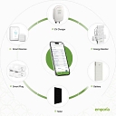
For residential homes, smart hardware monitors like the [Emporia Vue3 ](https://www.youtube.com/watch?v=Pye9MtWmtFs) or Sense Energy Monitor pair real-time circuit-level data with local weather feeds to pinpoint whether the heat pump or AC is the true culprit.
If you're trying to build or automate an explainer right now, let me know:
Are you doing this for a single residential home or a portfolio of commercial buildings?
Do you have access to interval data (hourly/daily smart meter data) or just monthly utility bills?
Compare kWh (electricity) or therms (gas) this billing period vs: - the previous month
the same month last year
a typical weather-adjusted period
Was the weather the reason?
Use Heating Degree Days (HDD) and Cooling Degree Days (CDD) to show how much heating or cooling demand the weather created. Degree days compare outdoor temperatures against a baseline (commonly 65°F) to estimate heating/cooling needs.
Separate weather-driven use from everything else
A simple chart works well: - X-axis: cooling/heating degree days
Y-axis: daily energy use
Show whether this month falls where weather predicts
Regression-based “usage vs. weather” charts are commonly used to estimate how much consumption is explained by temperature versus other factors.
Explain the bill in plain language
Example:
“Your bill increased by 32%. About 24 percentage points are explained by hotter weather: this month had 40% more cooling demand than last year. The remaining increase is from higher baseline usage, such as appliances, occupancy, or HVAC efficiency.”
A particularly effective format is a three-panel dashboard:
Bill impact: “Your cost went from $X to $Y”
Usage impact: “You used X% more kWh”
Weather impact: “Cooling demand was X% higher (CDD)”
Utilities are increasingly using this style because customers usually want to know why the bill changed, not just see the total. For example, Duke Energy’s Bill Insights feature uses usage comparisons and weather factors to explain customer bills.
If you’re building one yourself, the minimum data set is:
12–24 months of interval or monthly usage
billing dates
local temperature data
HDD/CDD values for the same periods
rates and fixed charges (because a higher bill is not always higher usage)
For a homeowner-facing explainer, I’d rank the approaches:
Weather-normalized “what changed and why” summary — best overall
Usage + temperature timeline chart — easiest to understand
Degree-day regression model — best for utilities, analysts, and large buildings
I can also help design a one-page bill explainer/dashboard layout if that’s what you’re creating.